Ubuntu 10.04 – A Quick Review
Tuesday, 8. June 2010
Ubuntu 10.04 – A quick review.
The latest Ubuntu release has brought both praise and controversy to the boards and email lists. The debate regarding some of the visual changes, as well as the new services tied to Canonical, has caused a minor tremor through the open source community. But even with all the controversy, it’s still worthwhile to load up 10.04 and see what all the buzz is about!
Installing the desktop from scratch.
Installing from the CD is extremely simple. They’ve hidden the ‘boot:’ prompt, and by default, they boot you into a GUI that allows you to choose either the Live CD or Install path. All and all, the screens seem a bit cleaner in the GUI install version. The one glaring thing is the new Ubuntu theme, but more on that later.
If you choose to do a network install, you won’t see too many changes. The questions are pretty much the same as the 9.10 install. There are a few more choices in the ‘tasksel’ menu, with the most apparent being the ‘Ubuntu Cloud’ setup. Although the Ubuntu cloud package looks pretty cool at first glance, I find it hard to justify this type of cloud for my client base. But that’s another subject all in itself!
The initial login.
Once your desktop install is done, you are booted into the Gnome Display Manager. The first thing you notice is purple everywhere! The new default theme will either grow on you, or drive you to anger, but the good news is that with minimal effort, you can make the desktop look anyway you want. If you installed from the CD, you’ll have a ton of updates to install. That is why I like the network install… Gets the latest versions off the mirror, but that’s just me…
This looks pretty good…
Although the desktop color choices might take a bit of getting used to, there is a certain polish that you can’t escape. It’s obvious that the developers have put a lot of work into getting the desktop look and feel right, with a few exceptions I list below. It seems that most of the bugs that I had seen in 9.10 have been brutally squashed for this release. The ‘Ubuntu Software Center’ utility appears to have gotten through it’s growing pains and lockups that plagued it in 9.10.
If the goal of 10.04 was to make it as rugged and stable as possible, I think they came through. One thing that is new to the desktop is the ‘Indicator Applet Session’ panel application. This actually is pretty cool, as it works whether Gwibber is running or not. The down side, is that you have to fine tune the setting for notifications in Gwibber, as you do not have access to those settings directly from the indicator application, but maybe that will be a wish list item for the next release!
What’s all this then???
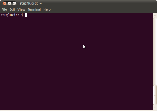
Ok, it’s time to talk about some of the controversial changes in the desktop. The one that catches your eye almost immediately, is the buttons on the top of the windows. They moved the buttons to the left side of the window bar!

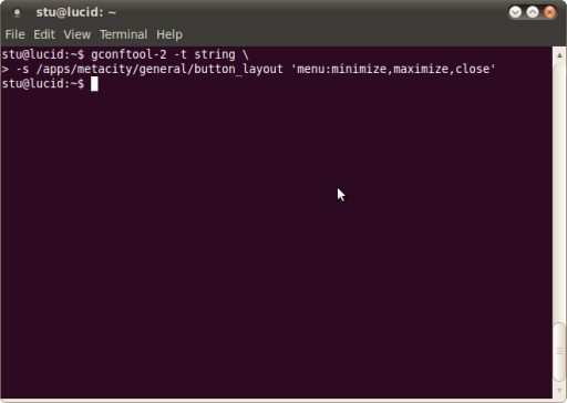
I guess if you a Mac user, then this is a good thing, but for me, it wasn’t. Luckily, there’s an easy fix. Just run this in a console:
gconftool-2 -t string \
	-s /apps/metacity/general/button_layout 'menu:minimize,maximize,close'
Just that simple! and your buttons are back on the right side, which is the Gnome/GTK default.

There are also some services that are running by default on the desktop… I choose to disable them, but the choice is yours… Here is the list:
- Evolution Alarm Notifier
- Personal File Sharing
- Remote Desktop
- Ubuntu One
All you need to do is go to System -> Preferences -> Startup Applications and un-check the boxes in front of the services you don’t want.
There are a couple of other annoyances (in my opinion) that are in this release… One that I was hoping they would fix was the ability to easily remove the ‘User List’ from the GDM login screen. This is not a new issue, as it showed up with the adoption of GDM2. Here’s the fix:
sudo su -s /bin/bash - gdm -c 'gconftool-2 -t bool \
	-s /apps/gdm/simple-greeter/disable_user_list true'
This will remove the list of users from the main login screen. The other issue is really a personal thing… I don’t use evolution, and the little message envelope in the notification tray is a totally wasted on me. I tried to delete it just like you could in 9.10, but quickly discovered that deleting it also got rid of the entire notification system. Turns out, the fix is to un-install the ‘indicator-messages’ package:
sudo apt-get --purge remove indicator-messages
That will remove the envelope icon.
All and all, I like 10.4. And, I think you will too!
— Stu

